
Killer Logo and Brand Refresh

Project Overview
Killer Infographics needed a new logo and brand refresh to cater to it's expanded list of offerings. Moving away from static 1-off projects to more robust visual campaigns, Killer needed something more all encompassing for its brand. In addition, refinements to the brand color palette and establishing an illustration style that would compliment the new logo were expected. This is a glimpse at the process and my contribution to the project.
Goals
The goal was to design a logo that would represent visual communication and match Killer's creative criteria. The logo required the ability to animate. It would not be color dependent, and it would be able to scale.
Elaboration on the brand meant adding an additional color to the brand palette that would be an appropriate accent to the already existing palette. In addition an illustration style needed to be established to build out a set of icons that would showcase Killer's specific service offerings.
My Role
As Art Director it was my responsibility to organize team meetings to discuss direction and limitations. Gathering insight and perspective from those meetings I designed the final version of the logo. Working closely with our exec team and CEO I also developed our refined color palette with proposed implementation of the new color. My role also entailed building the illustration style for our service offering icons and creating those icons myself.
Word List
The first step I wanted to take was exploring a list of words that could embody the tone of the new logo. This was a helpful exercise in getting at what the logo would communicate.

Inspiration
For inspiration I looked at corporate logos from the 60's and 70's. I love the bold use of shape and negative space shown throughout. I also looked at more modern approaches that used similar conventions.

Sketches
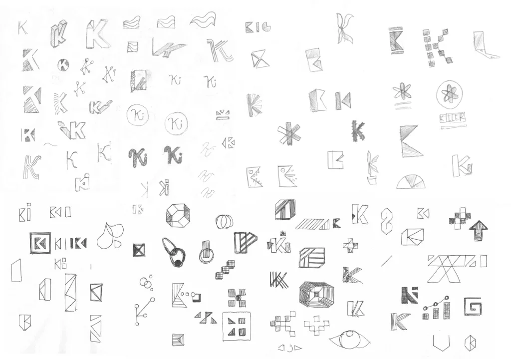
After research and collecting inspiration I organized a design sprint with my team to brainstorm initial concepts. I wanted the designers to sketch numerous directions for the new logo. From this I was able to hone in on a more precise direction.
Refined Sketches
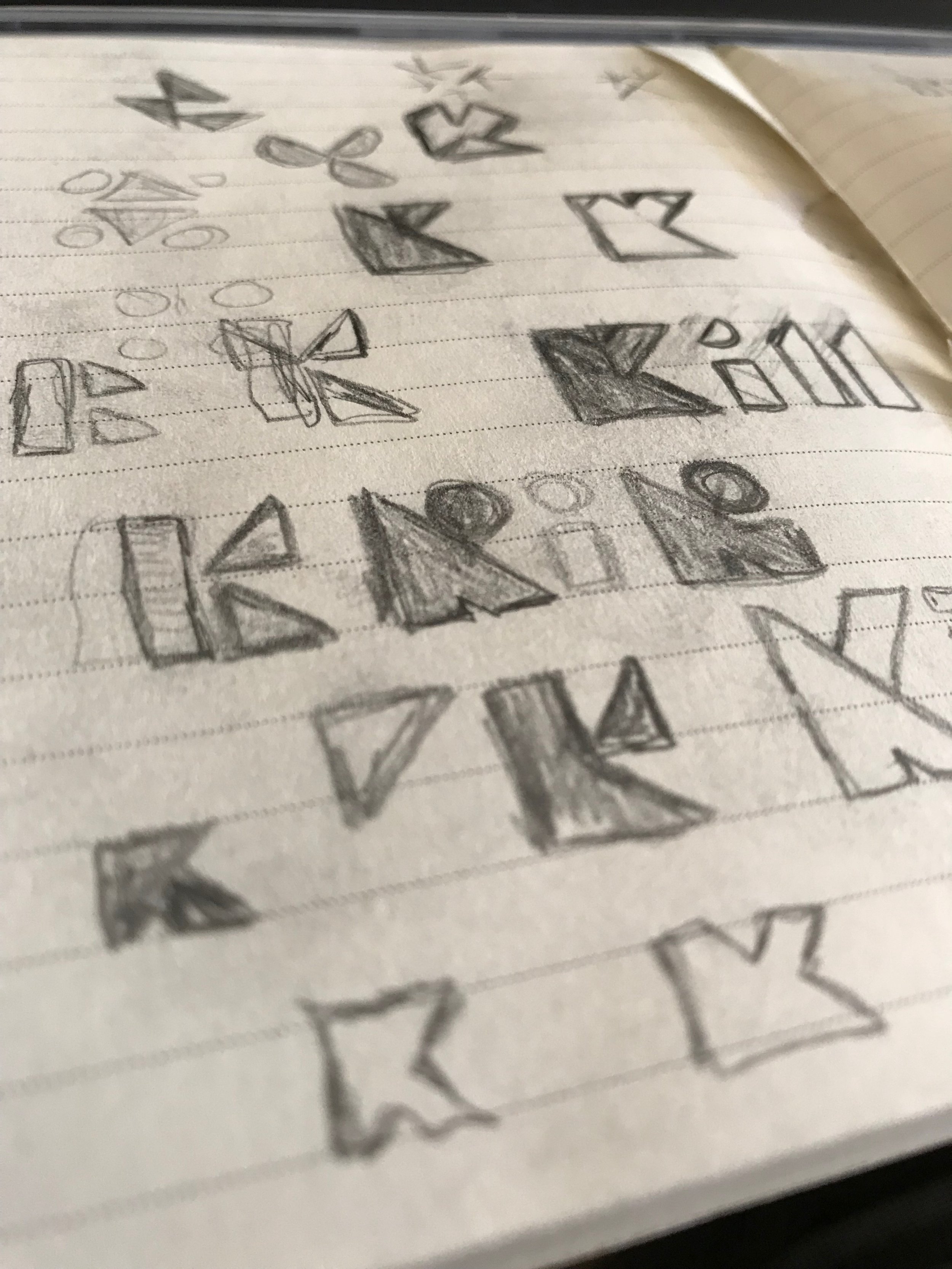
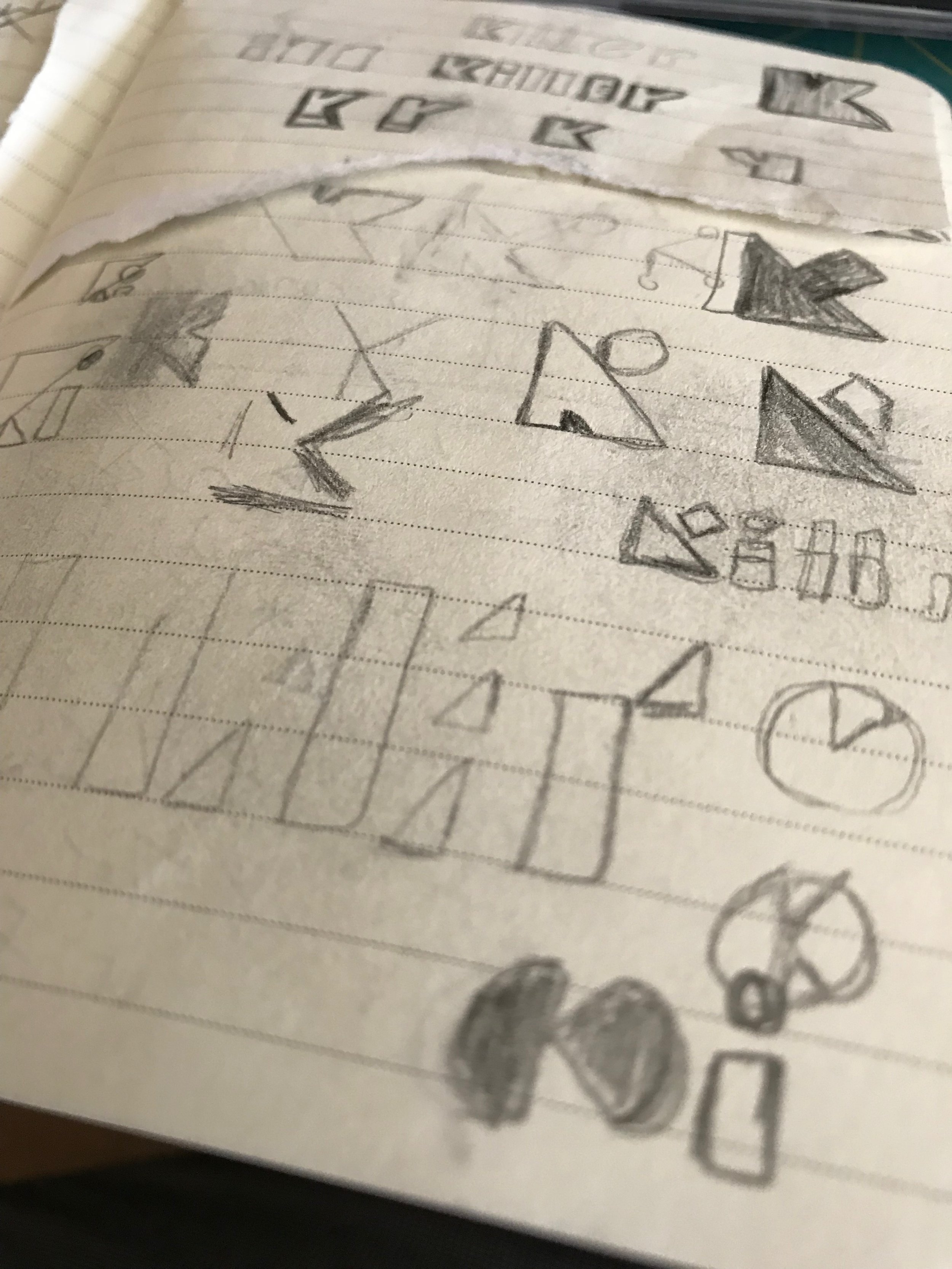
From the initial collection of sketches I wanted to focus on the idea of unique shapes being representative of our three core offerings. Interactive, Motion and static all work in tandem to build our campaigns. These shapes needed to come together and still abide to the goals for the final logo.
Vector Iterations
Using the refined sketches as a foundation the team and I began to create vector logo concepts in Adobe Illustrator. This allowed for rapid color and scale iterations.

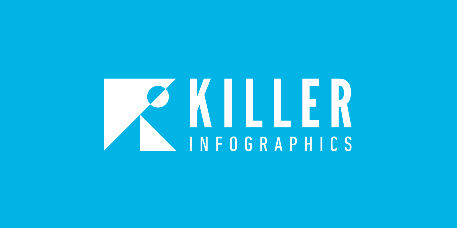
The New Logo
Multiple lockups were made to cater to the various uses of the logo. The mark remains the same across all lockups while the typography varies. Spacing limitations were set on each approach to maximize legibility and impact.


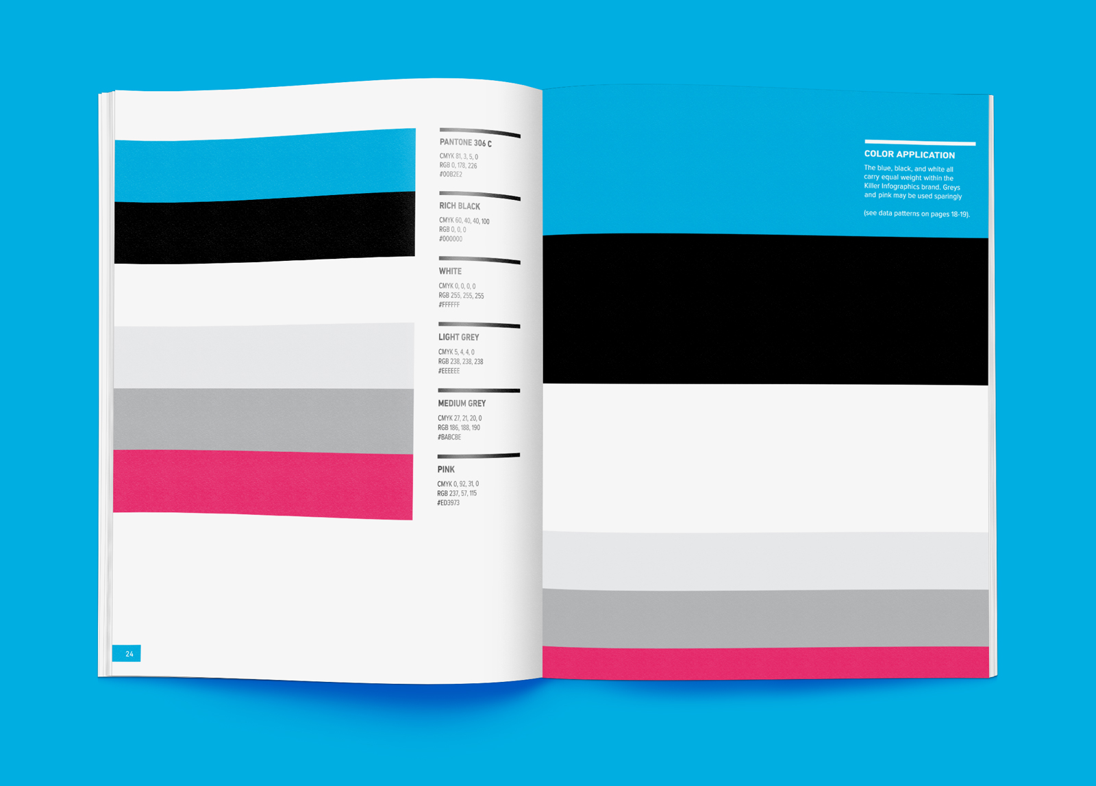
Brand Color Palette
A new color needed to be introduced for points of emphasis and calls to action. I felt it was important to use this color sparingly so I wanted to build out clear guidelines for application.

Icon Illustration Style
To complement the solid use of color in the logo I created an illustration style that used strokes. I included a subtle line pattern and simple shadows to add more depth to the illustrations.
Results
The final logo is a geometrically sound mark that is representative of Killer's new directions. It has received high acclaim from clients and colleagues alike. The new illustration style and color refinements have contributed to a cohesive brand that is projecting Killer into the future. Killer pre-sold nearly one million dollars in campaigns after this brand refresh.